We’re pleased to share that Rupert Hine’s book on the art of songwriting, production and distribution is shaping up well, with many interviews now complete and more underway. Before long we’ll need to draw the line—within the next couple of months we’ll turn our attention to compiling the final manuscript from the wealth of stories and insights gathered covering his life and work. These span from early school bands, through Rupert's decades-long heyday as a producer and artist, to his still recent role as an industry luminary and technologist.
At its heart, the book reflects Rupert’s greatest passion: giving a voice to those who have something to say. Whether newcomers to the industry, artists facing career challenges, or simply seeking an outlet for expression, Rupert’s gift was to help people communicate through the art of song. In many ways, this book is his legacy—created so that current and future generations can benefit from the same skill, wisdom, and even-handedness.
This new page will share background to the book from Rupert’s own perspective, alongside reflections from those who knew and worked with him—stories of how he inspired, supported, and enabled their creative journeys. Compiler and editor Jon Collins is weaving these voices together with Rupert’s distilled wisdom, thus illustrating Rupert’s approach, process, energy, and passion, showing just how deeply effective and influential he was, and ensuring his impact continues for years to come.
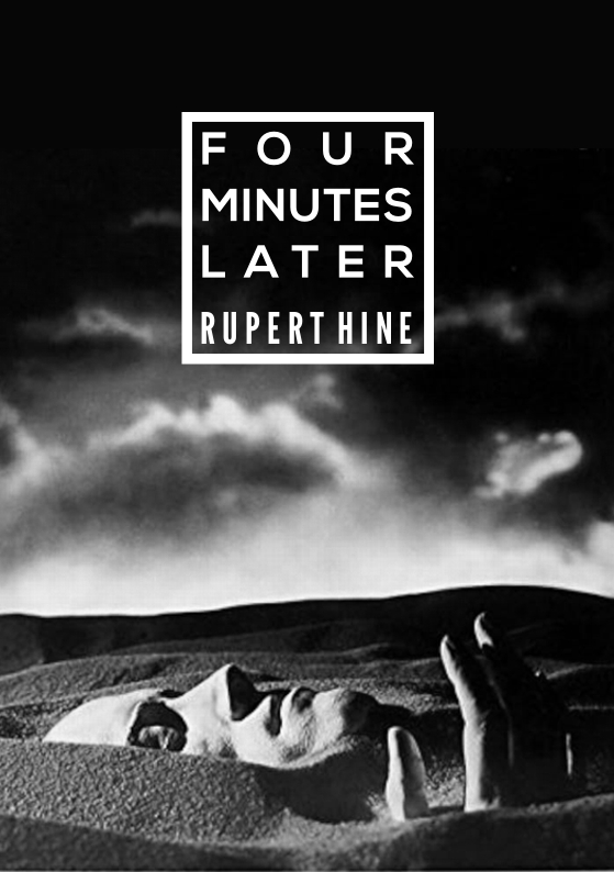
VERSION IIIWAVING NOT DROWNINGWe come now to a suggestion Fay made about using the art from Roop’s third album, which, it must be said, comprises a notable departure from the first two by way of its dramatic and surreal atmosphere (it appeals to me today just as much as it did when I first saw it some 40 years ago!) In scouring the Internet, I discovered that the image appears in tints other than the sepia tone I had first seen. And so, as a matter of simplicity and distinction, I created a version in pure black and white to give it a separate—but familiar—identity for its new purpose (and, perhaps, new audience) as a book cover though the finished illustrations could be re-tinted back to their original sepia tones. I felt that such an approach would make the whole concept look more timeless, like a classic movie (“Citizen Kane” comes most to mind). The technique, I think, also has the effect of depicting Roop’s Sphinx-like visage and hands as some enduring, timeless monument to his music and legacy as photographed by some past, present, or future explorer—terrestrial or not—who just happened upon it after wandering the desert. Lastly, I force-justified the title and author text given their centred position on the page for a more expansive—almost hieroglyphic look—in the negative space above the landscape (the effect becomes particularly acute as the frame that surrounds the text takes on the air of a stylized cartouche).
Christopher Pavlik … cpavlik@forcetendesign.com … https://www.forcetendesign.com